The Candy Store - Branding & Web Design
The The Candy Store project was built from scratch, with the goal of capturing joy, energy, and playfulness for a brand dedicated to premium sweets.
Client
Through colorful, modern, and friendly branding, combined with a sleek and user-friendly website design, we shaped a visual identity that resonates with both children and adults seeking sweet and memorable experiences.
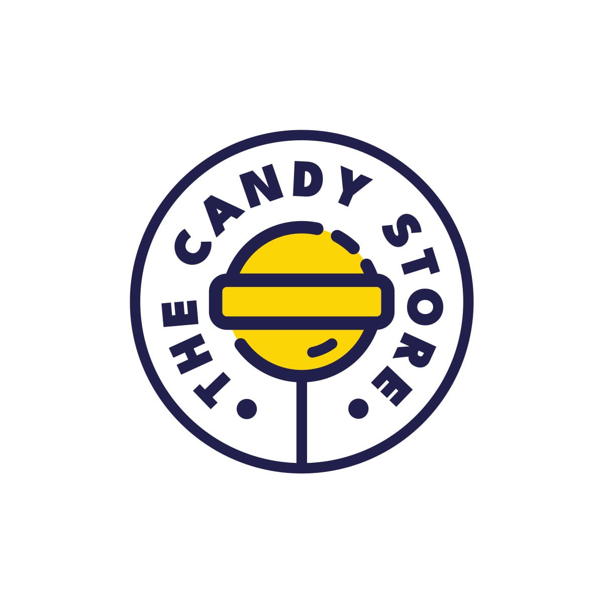
At the heart of the brand identity stands the logo – a minimalist yet expressive design where a stylized lollipop becomes the central symbol. Vibrant colors like energetic yellow and dynamic pink are balanced with a deep navy blue, creating a pleasant and memorable contrast. This chromatic harmony reflects both the playful and professional sides of the brand.
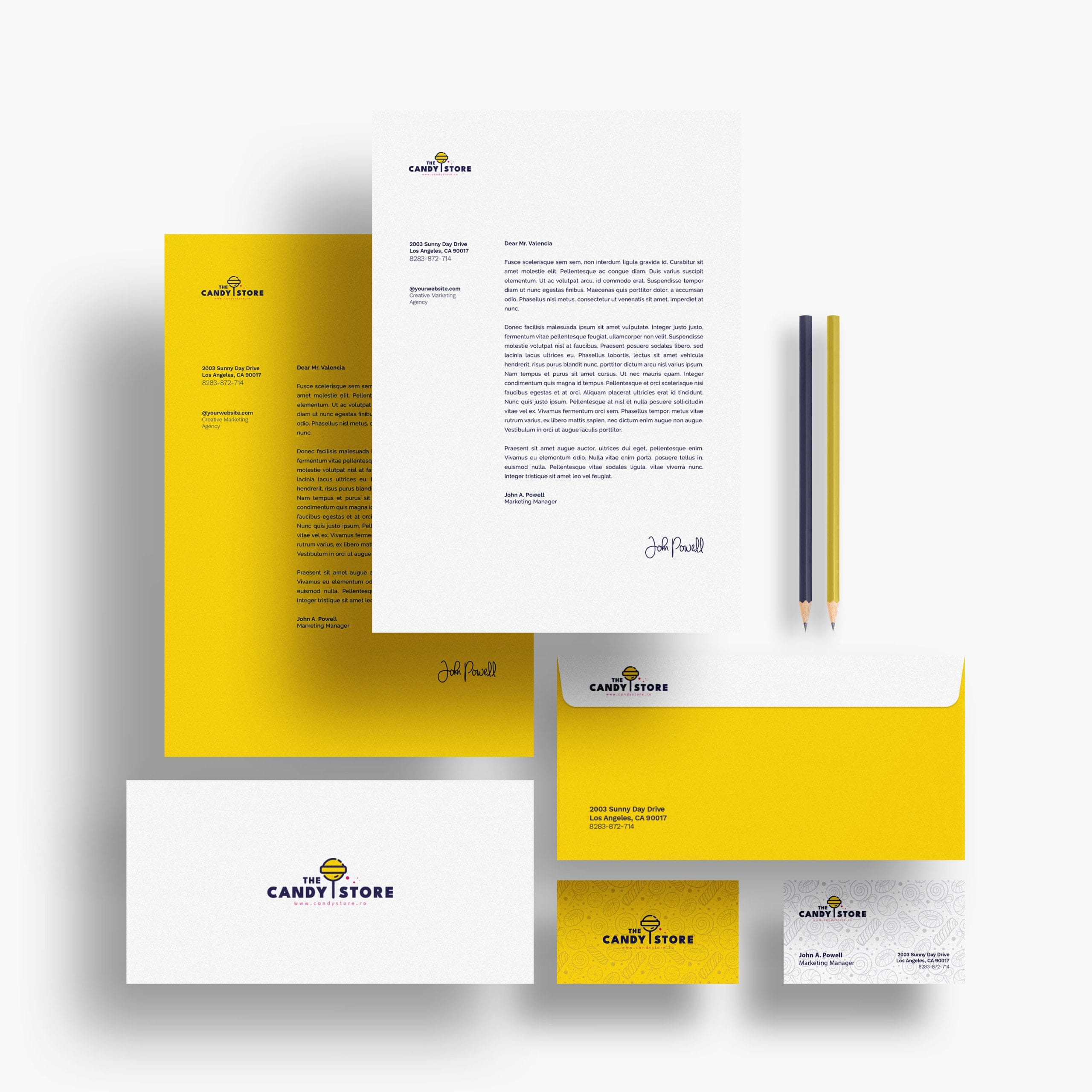
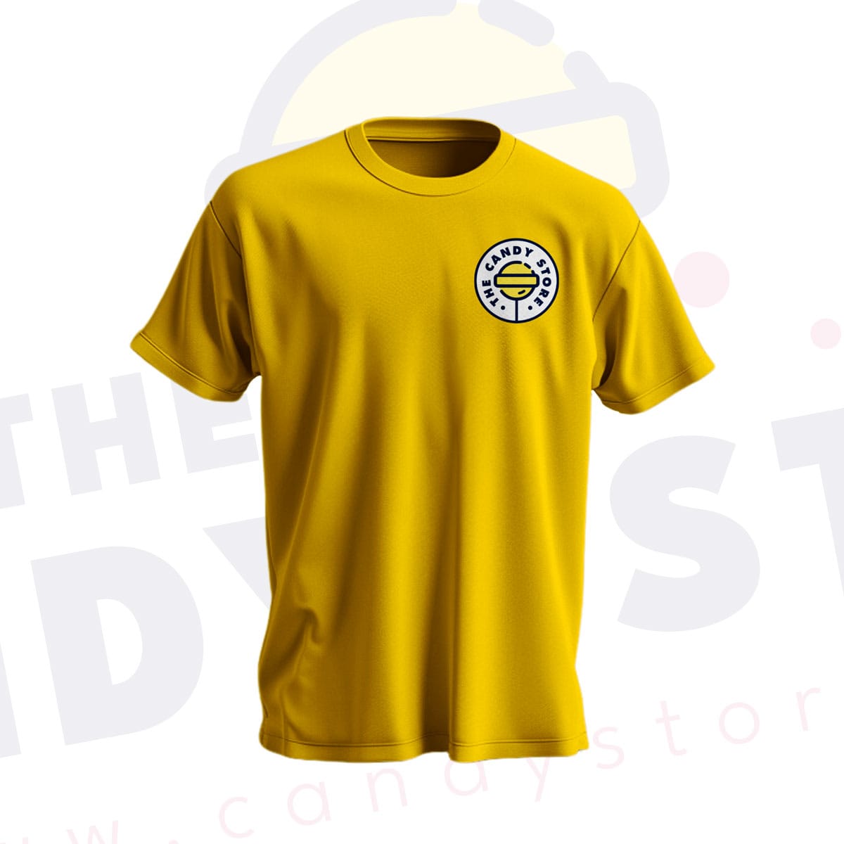
The branding included a full visual identity package: logo design, color palette, typography, and supporting graphic elements that ensure consistency across all media – from packaging and promotional materials to digital communication.
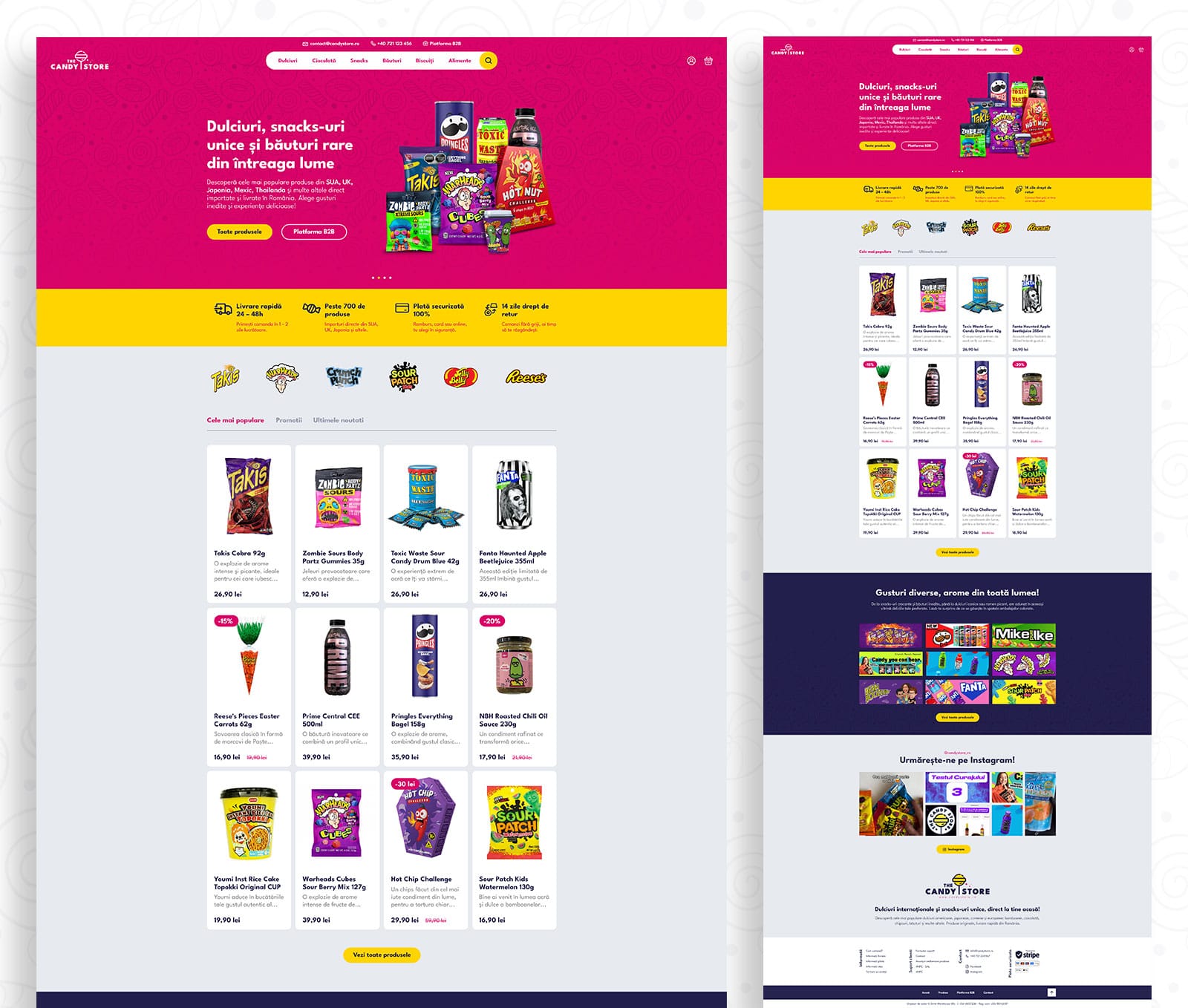
In parallel, we designed the website, focusing on a simple, enjoyable user experience. Its clear structure highlights products at the forefront while making navigation easy and intuitive. Custom illustrations and playful graphic details maintain brand coherence online, reinforcing the cheerful and vibrant personality of The Candy Store.
Services provided:
- Complete branding (logo, color palette, typography, graphic elements)
- Promotional and brand application design
- Modern, user-friendly web design focused on UX
- Ecommerce-oriented layout and structure
- Themed illustrations and graphic accents
The result is a memorable brand identity paired with a digital experience that works as a friendly, engaging online space – perfectly aligned with the brand’s positioning.
Related work


